
Hello Stampin’ Friends,
I hope you had a wonderful weekend. A bit dreary here in south eastern Wisconsin but I love that everything is still so green around here. Usually at this time of year, everything is dried out and brown.
On Saturday I posted the “Reverse Spotlighting” technique instructions, and promised to post a couple of cards to showcase this technique. So after taking Sunday off, I have two beautiful cards to share with you today.
First, I would like to start with a card that was created per the instructions that I gave to you on Saturday. My color combination is Pink Pirouette and Early Espresso. I love those two colors together.
The stamp set I used is “Betsy’s Blossoms” (Wood – 131955 / Clear – 126006) found on page 87 of the Idea Book & catalog…. the big one.

Just as the instructions stated, you stamp your imaged onto the cardstock … I did the pink onto Whisper White, then punched out sections of my flowers with the 1-1/4″ Circle Punch (119861) found on page 182.
Then I stamped three flowers using Pink Pirouette ink onto Pink Pirouette cardstock and cut them out. Now you just line up the images and secure, and then assemble the rest of the card.
The greeting “get better” is from the stamp set “A Dozen Thoughts” (Wood – 131056 / Clear – 131059) in the Idea Book & Catalog on page 59. You can use a marker to eliminate the first “better” or just use the stamp pad to ink the area you want to use. The entire greeting is … “Better get better”.
I used the “Word Window Punch” (119857) on page 180 and the “Modern Label” (119849) punch on page 181. And to finish it off … I used the pretty “medium” size pearls ( 119247).
On the second card I wanted to give the classic “Reverse Spotlighting” technique a bit of a twist! Instead of using punches … I used the “Framelits” – Oval framelits (129381) to be exact! You will find these on page 186 of the catalog, along with the other framelits.
You follow the same concept, but you won’t have to do as much cutting … and who doesn’t love that!
I decided since I was going to give this technique a new twist, I would use a new stamp set. My choice was the beautiful poinsettia from the stamp set “Joyful Christmas” (Wood – 131802 / Clear – 131805) and you will find it on page 27 of the Holiday Catalog. If you need one … let me know.
I can’t wait any longer to show you …. I JUST LOVE THE WAY THIS CARD TURNED OUT!!
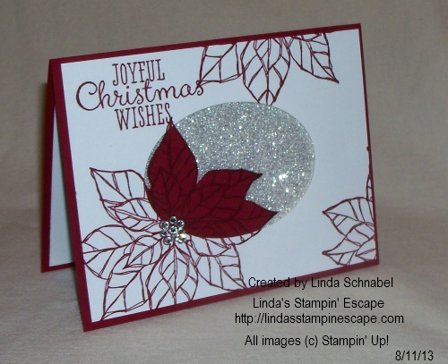
I kept the color pallet on this card very simple … Cherry Cobbler and Whisper White, with the Silver Glimmer paper (124005) to give it that “WOW”. The “Rhinestones” (119246) accent nicely with the glimmer paper and still keep the overall feel – clean and simple.
Again, I stamped the Cherry Cobbler ink onto both the Whisper White and Cherry Cobbler cardstock.
The white cardstock is actually “popped up” and away from the glimmer paper to give it more dimension.
I hope you enjoyed today’s cards … and I would love to hear your thoughts, so please feel free to comment.
Have a wonderful week …


Wow!! That Christmas card is particularly beautiful!!