Hello Stampin’ Friends ~
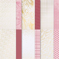
As we bid adieu to our week-long exploration of exquisite gold color combinations, we reserve the grand finale for a pair that not only complements gold but elevates it to new heights – Petal Pink and Basic Gray. These two hues, when intertwined with the shimmering brilliance of gold, create a symphony of elegance and sophistication.
For our concluding showcase with the Most Adored designer paper, I chose the design adorned with delicate gold hearts. Armed with blending brushes and the soft blush of Petal Pink, I embarked on a journey to craft a gradient effect that would serve as the perfect backdrop for our design.

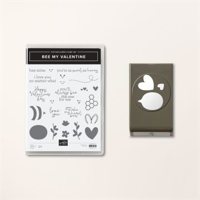
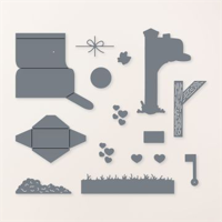
The stars of the show, the adorable bees, were meticulously fussy cut from the Bee Mine Designer paper. I incorporated the Bee Mine bundle, utilizing both the sentiment and die cut from this delightful collection. The result was a seamless integration of elements, each contributing to the overall allure of the project. And a touch of the Wink of Stella on their wings.
What truly sets this card apart is the attention to detail… I think it’s my favorite! The bees, with their intricate patterns, add a touch of whimsy, while the sentiment and die cut from the Bee Mine bundle infuse a heartfelt message into the design. It’s not just a crafting project; it’s a visual story, told through carefully chosen elements that weave together seamlessly.

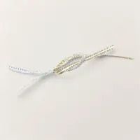
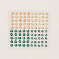
To add the finishing touches, I reached for gold cord and Petal Pink Foil Gems. The gold cord, with its understated glamour, brought a sense of unity to the composition, tying together the gold highlights from the Most Adored designer paper. Meanwhile, the Petal Pink Foil Gems introduced a subtle shimmer, echoing the softness of the Petal Pink gradient.
This final card encapsulates the essence of what we’ve discovered… It’s not just about colors; it’s about the stories they tell, the emotions they evoke, and the artistry that unfolds when they come together.
On the Flip Side …
When we turn the page on our Most Adored Designer paper, it reveals a charming transformation from shimmering gold hearts to a delightful pink and red plaid. Where our first card was all about the glitz and whimsy, this card is bold and to the point.
I cut three 1 1/4″ x 4″ pieces of the plaid pattern and matted them in Real Red. This not only accentuates the boldness of the red and pink hues but also adds a touch of sophistication to the overall design.
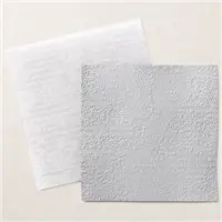
For the backdrop, I opted for a Basic White mat, which was embossed with the timeless Timeworn Type pattern. This embossing detail introduces a subtle texture, elevating the visual appeal and adding a vintage touch to the composition. It’s a nod to the past, seamlessly integrated into the contemporary vibrancy of the plaid pattern.

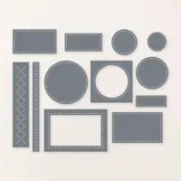
The sentiment, borrowed from the Bee Mine bundle featured in our initial card, takes center stage once again. However, this time, it undergoes a transformation of its own, being die-cut with the versatile Everyday Details Dies. This alteration not only reinforces the adaptability of the Bee Mine bundle but also infuses a fresh perspective into the sentiment, making it a perfect fit for this design.
To add a final touch of sweetness, small red hearts were delicately die-cut using the Sending Love Dies. These whimsical embellishments scatter across the card, tying together the theme of love and warmth.
If you’ve been following the past 4 days, you’ll note the Most Adored Designer paper has proven to be a canvas of endless opportunities, and there’s joy in every discovery. Thanks for hanging out with me during this discovery of color and techniques!

Here is a list of supplies I used for today’s cards ….