
Hello Stampin’ Friends,
Yes … I missed a day but I’m back with the my “how to” as promised. To be honest, the best way to learn how the Blendabilities work is to play with them, but until you get yours, I’m here to help.
Grab a cup of coffee and sit back and relax while I take you through the steps to coloring magic 🙂

Let’s start at the beginning. You will want to pick a line image (like our friends up above) and stamp it with the NEW Memento Ink Pad onto our Whisper White cardstock – as that works beautifully . Memento™ dye ink is fast drying and fade resistant. The innovative pad delivers finer impressions and exceptionally even coverage. It is also acid free!
Now you are ready to choose your color pallet … today I’m using Coastal Cabana! There are three markers per color assortment. They are alcohol based markers are made for blending and shading. They are Acid Free and Lignin Free too!
You can work from light to dark, or dark to light … depending on your color technique. I’ve always used Stampin’ Up!s design to guide me … makes me look like an artist!!
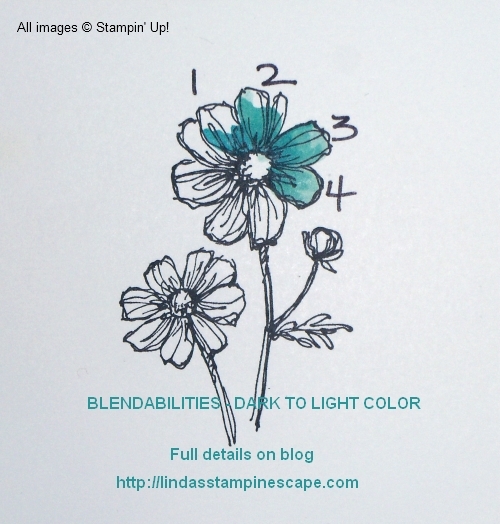
On my first sample I am beginning with the light color first, and I color the entire petal (1). Then I’ve added the medium color (2) and last, the darkest color in the assormtment (3). You can go back over the image again with the light color to blend (4).

On this sample, I started with the darkest color first – again following their image and only coloring where there are the lines(1). Next I brought my medium color into the center, and coloring over the dark color to create a soft blend(2). Then I added the lightest color, going over the other two previously colored areas(3). And finally going over it again with whatever color works best for blending and getting you the impact you desire (4).
As far as which tip you use, it really is your preference. I like the brush tip for larger areas, however, I know other demonstrators who prefer the harder tip as it feels more like coloring. I must admit, when working in small spaces, the smaller tip works wonders!
If you use the brush tip … color at an angle, it gives you a softer effect and you won’t damage the tip. I will say that the construction and materials used in the tips of these markers are very sturdy.
Just remember that different images will require different coloring techniques … I obviously did not spend that much time and layer of colors with the stem and leaf.
It’s learning some basic techniques and then just having fun with it. And don’t worry when you see the color coming through the back … it’s alcohol based and will do that. I suggest making sure you are stamping on your scratch pads.
The designer paper I used for our card is the “Back to Black” and part of the buy 3 get one free promotion.
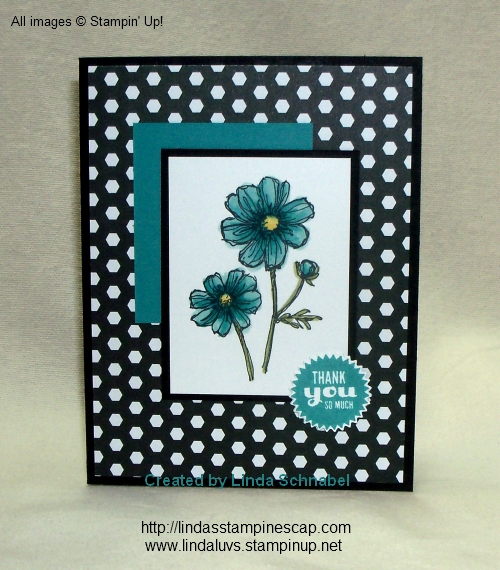
My greeting comes from the stamp set “Starburst Sayings” and I used the coordinating framelits to cut it out. I used Bermuda Bay ink for the greeting, and the cardstock behind the flower to pull out the darkest color of the flower. I did however use the “Coastal Cabana” Blendabilities assortment to color the flower. Don’t you just love how easy it is to pair up the Stampin’ Up! colors!
The other colors used to color are Daffodil Delight and Old Olive Blendabilities. I hope you enjoyed the card and explanation. I realize it gets a bit wordy … so thanks for sitting through it.
Again, thank you for stopping by today… I would appreciate your comments.
Have an awesome day and a Safe and Happy Holiday Weekend!