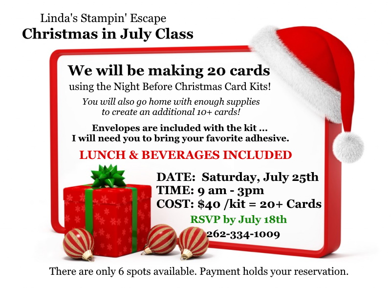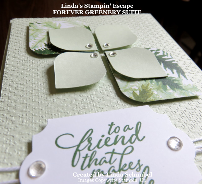
Hello Stampin’ Friends,
I hope you enjoyed your July 4th celebrations, or got to relax a little, if not, grab a cup of coffee and join me as I share two layouts featuring the “Peony Garden” Designer Series paper.
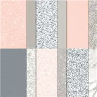
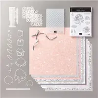
Hope you had a chance to check out the Peony Garden suite that I shared yesterday … today, I’m highlighting only the designer paper. The soft florals and versatile designs make this paper a treasured find for your collection.
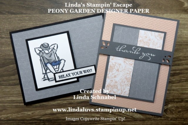
Let’s start with out first card, a bit of a surprise considering out designer paper is called “Peony Garden” …
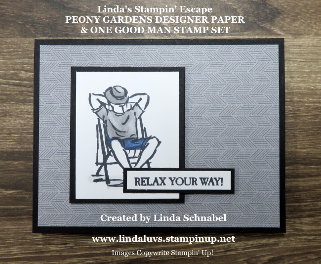
I couldn’t wait to share this pattern with you, not what you expected but the pattern suits a masculine card perfectly. I teamed this one up with our “A Good Man” stamp set. A simply layout … yes, but it is simply Sunday.
Wait till you see this same designer paper pattern used on my next card!! The design reminds me of a tweed so I paired it with a lovely floral pattern in Petal Pink ….

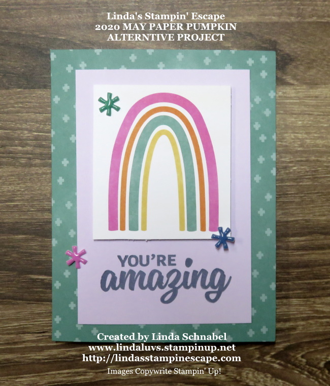
We are stepping up our layout for the second card. I used two strips of designer paper in different patterns – these are cut to 1-3/8″ x 3-3/4″ … they are cut off at 1-1/4″ and then placed on a 4″ x 3″ Basic Grey mat. This is then attached to the Petal Pink which is embossed with the new Tasteful Texture 3D embossing folder.
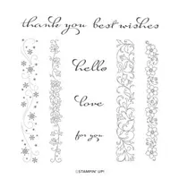
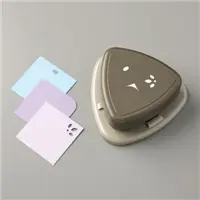
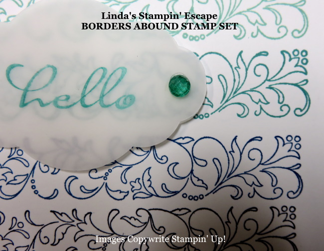
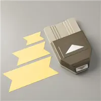
The “thank you” comes from the “Borders Abound” stamp set . I share a card with you a few days ago featuring that stamp set (See Here). Check it out … I think you will enjoy it. I love this font and think it adds an elegant touch to the card. It was heat embossed in white and the ends punched with the Detailed Trio Punch.
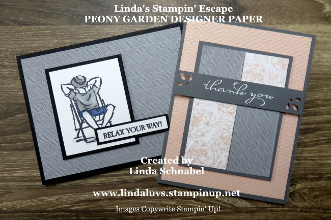
It is amazing how a designer paper pattern can influence the style of your card. On our first the gray is masculine but on the second, it adds a formal touch, and combined with the softness of the floral pattern and fanciful font … you end up with charming card.
Thank you for taking time out of your holiday weekend to join me. I will be sharing “more” with the Peony Garden Designer paper the next few days. If you LIKED today’s post … please click the LIKE button at the bottom of the page.
Enjoy the rest of your day.

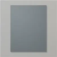
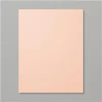
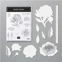
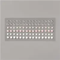
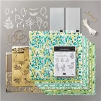
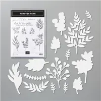
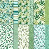
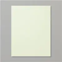
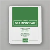
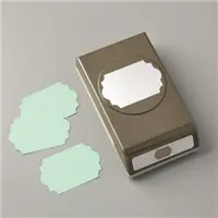
Here is a list of the product I used to today’s cards. Find out more information about these products by clicking on the image … or you can begin your shopping from here as well. Thank you!