Walk in the Wild – Card Share #1

Hello Stampin’ Friends,

As promised … I have the first of 3 cards from the Walk in the Wild stamp set to share with you.  I am beginning with the pheasant.

I used the technique that my clubs learned this month … Foil Embossing.  It’s quick, easy and oh so cool!  In fact, they will love to see that I am using the same layout they used for the “Thank You” card in class.

000_2222

My image was stamped with StazOn and colored in with the Pear Pizzazz marker and the Blender Pen to apply the Island Indigo and Crumb Cake

When creating your foil background … you will need to use the “Heavy Duty” foil. We then glued a piece of cardstock onto the foil … trimmed off any access and then ran it through the Big Shot.  I used the “Woodgrain” textured impressions embossing folder.

One simple stampin’ tip … Remember when applying a piece of cardstock on a half sheet, only put adhesive on the half that will be in contact with your card.

000_2224

I told you it was simple. I’d love to hear from you … please share any ideas with our blog followers on how you would use this technique.

Thank you for dropping by today …

Have an awesome weekend ~

blog-closing-small

TODAY’S STAMPIN’ SUPPLY LIST …


Spring Retreat Masculine Swap Share …

Hello Stampin’ Friends,

I know that I told you I would be sharing cards from “Walk in the Wild” and I will … but last night one of my club members asked to see some swap cards from the second retreat, so today I’m going to post two.

Both cards are made with the “Four Feathers” stamp set.  Don’t worry, just because they are not in the catalog, does not mean they are gone.  You can find them in the “Returning Favorites” section of my website. Just click on the link and you can see what else is available.

This first card was created by Tanya D.  I love the color pallet … very masculine! The background was created with the “Arrows” embossing folder.

000_2208

The cute greeting comes from the “Just Sayin'” stamp set and was teamed up with the “Word Bubbles” framelit dies.  Don’t you just love framelits!!  No more fussy cutting!

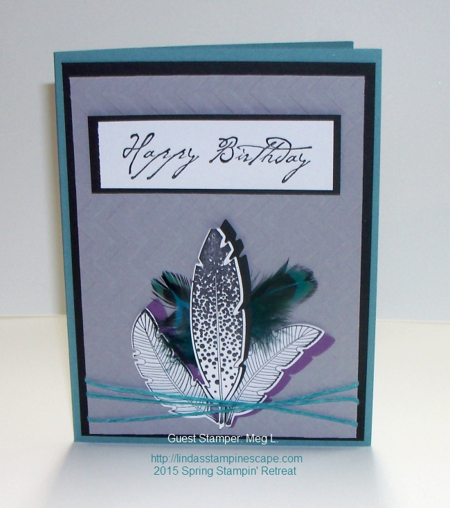
Our second card was created by Meg L. Same stamp set … different look.

000_2215

Meg used the “Chevron” impressions embossing folder and tied it all up with the “Coastal Cabana” Thick Bakers Twine.

Both cards are awesome … but not the winner! I’ll be posting that one later.

Thanks so much for checking out our swap cards. I have a list of the core items used for these two cards below.  Just click on the link for product details.

I will be back this weekend with the “Walk in the Wild” cards for you.

Have a wonderful weekend!

blog-closing-small

STAMPIN’ SUPPLY LIST …


Sad to say goodbye …

Hello Stampin’ Friends,

For those of you who followed my past few posts, you know that I was away at our second of two Spring Retreats. As the first, we had a wonderful time, plus we were blessed with a most beautiful weekend.

IMG_20150419_073331

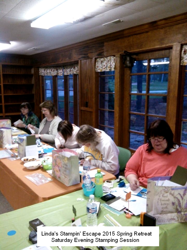
Yesterday I showed you how I set up my stamp room for our guests … here is a pic of our afternoon stamping session:

11143159_897324460339650_1485341471369200345_n

Our guests are creating one of the many projects we have prepared for them. All of our cards were created with different “folds” …

11218768_897324510339645_7939395352458968612_n

We take several breaks throughout the day … it feels good to stretch! Plus there is always a good meal waiting for them when they return to the house.  Here is a shot of our last stamping session …

11178364_897465696992193_4765070950460322918_n

After this session we returned to the house for dessert and good conversation. It was a beautiful night, and just shy of the full moon.  Got this shot coming out of the stamping area and returning to the house …

Spring Retreat - May 2015

None of us can believe how fast the weekend goes! Just one more gathering around the table for breakfast before everyone heads home.  Eileen and I pack up and head out too …

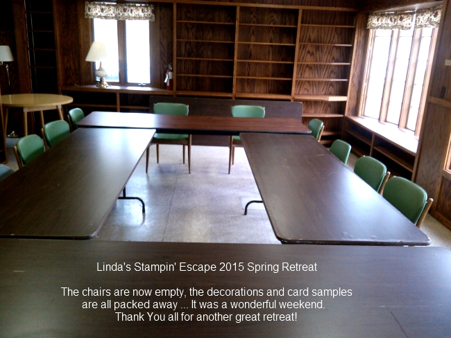
Spring Retreat 2015 - All done

It’s kind of sad to see the room empty and the tables cleared off, but we had a good time and there’s always the Fall Retreat to look forward to.

A big “THANK YOU” to all that attended and thanks to you who followed us on the blog and my facebook page “Linda’s Stampin’ Escape”… we hope you enjoyed it.

Have a great week ~

blog-closing-small

Reminiscing … A Walk in the Wild

Hello Stampin’ Friends,

With the retirement lists out, I’d like to reminisce on one of those stamp sets you love … A Walk in the Wild. This was a great stamp set for masculine cards… and I’m going to miss this one!

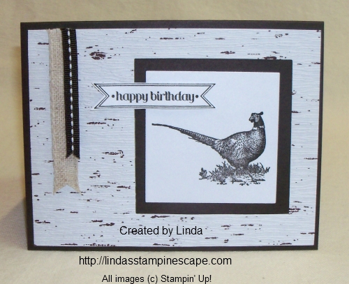
My first card is the pheasant … I did this birthday card in November of 2013. Simple color pallet and the use of ribbon for banners make this card very appealing to the guys.

000_0389


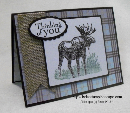
My second card is the moose … he is so stately! I created this one back in August of 2013.

I teamed this image up with some designer paper and the burlap ribbon. The burlap gives the card some great texture, yet does not take away from the moose image at all.

000_0111

Both cards used a simple layout … but with different backgrounds and accessories, they look well put together. While making cards for guys, you never want to “over” embellish.

Hope you enjoyed this little flashback, and if you don’t have this stamp set … you may want to add it onto your wish list.

Thank you for dropping by my blog today!

Have an awesome one ~

blog-closing-small

Saturday’s Simply Masculine …

Hello Stampin’ Friends,

Today I have created a card for you that can be made in just minutes! It’s super easy and very masculine.

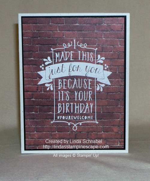
I began with our “Adventure Bound” Designer Series Paper pack and chose the brick pattern. I trimmed it down slightly smaller than the basic 4″ x 5-1/4″ because I wanted to mat the designer paper.

000_1887

That 1/8″ pop of black from our mat really makes the brick stand out. I mounted these onto the “Naturals White” cardstock. It compliments nicely with the brick and creates a look of texture that the Whisper White does not … perfect for our masculine card.

000_1888

Next, I grabbed my “Balloon Bash” stamp set … I think this is such a fun and versatile set. It’s also bold enough to stamp and embossed directly onto designer paper and still pop! It does not get lost in the background of the designer paper.

I stamped the image with the White Craft Ink and then embossed with white embossing powder. That is it … simple, fun, and very masculine!

000_1887

Thank you for dropping by to visit my blog today.

I wish you a simply wonderful Saturday ~

blog-closing-small

STAMPIN’ SUPPLY LIST …


Sail Away …

Hello Stampin’ Friends,

Today’s card share begins with the Traveler stamp set, so sit back, relax and enjoy the trip.

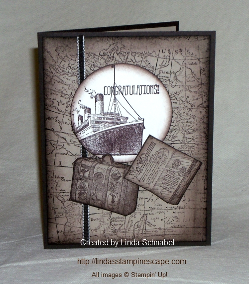
I started with Early Espresso as my base color and then added Crumb Cake and a pop of Very Vanilla.  Our background stamp is the “World Map” … the edges were sponged to created a softer, yet aged look.

000_1456

I used the 2-1/2″ circle punch to create the focal point of my card and highlight the ship.  So I’d be ready to go … I cut out my passport and luggage with our “very sharp” paper snips.  It makes trimming around the baggage (hehehe) easy breezy!

I stayed with the neutral colors but you could go all out and really add some color to this card by coloring the background like a world map!  Have fun with it.

Thanks for stopping by… and enjoy today!

blog-closing-small


Time for a “Man Card” …

Hello Stampin’ Friends,

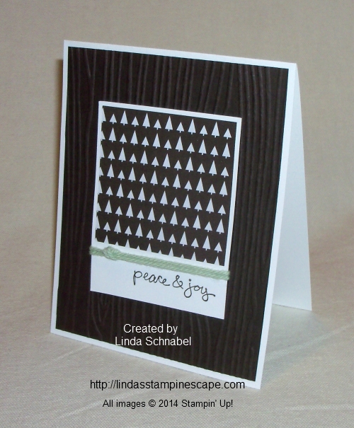
We are always looking for masculine card ideas, even at Christmas time … well look no further!  I have the answer to your “I need a manly Christmas Card”  search.

I wanted to keep it simple so I chose the monochromatic color scheme of Early Espresso and Whisper White with just a pop of Pistachio Pudding.

Today I’m using the “Trim the Tree” Designer Series Paper Stack to create my “manly” Christmas card.    This paper stack has so many delightful patterns you will be able to make a ton of great cards with it. I picked the “trees” and teamed it with the Woodgrain embossing folder.

000_1430

Instead of a bow, I used the Thick Bakers Twine and simply tied a knot into it.  It’s great for guy cards and added a nice touch of dimension.

The greeting “peace & joy” is from the exclusive “Good Greetings” hostess set.  Remember you can get this free when you have a qualifying stampin’ party, book show, or order.  Contact me for details.


Here is a list of our current Stampin’ Up! promotions …

contact me hostess special  PP - 50 off

Just click on the picture (link) for full details or CLICK HERE to view the all.

Thanks for stopping in today, tomorrow I will have more with the left-overs from the designer paper!

Have a wonderful day!

blog-closing-small

 Here is a list of today’s ingredients …


Travel the World! Last Day …

Hello Stampin’ Friends,

As promised, another swap card from our demonstrator gathering.  This card is from Kathy C… one of my Star’s!

Kathy used the Traveler stamp set.  My clubs used this last year and will love to have another sample.  How beautiful is this card!

Kathy began with the World Map background stamp … and used the new Blendabilities Markers and some sponging on this card. I love how it really defines the map.

000_1398

The ship from the Traveler stamp set was stamped on Whisper White and then cut out with the Window Frames Collection Framelit and then matted with the same.  It really creates a nice focal point to her card.

6a00e54f95df92883401b7c6d00655970b-500wi

Travel is only one of the perks of being a Stampin’ Up! demonstrator! TODAY is the Last Day to take advantage of FREE additional merchandise.  You chose $150 worth of products for only $99.

Plus there’s FREE Shipping … It’s a great time to take advantage of the savings.  There is no obligation to do anything further, or you can chose to get your friends over and save 30% off your first order.

LET’S HAVE SOME FUN HERE …. Go get your Holiday Catalog, now turn to page 51.  Let’s Play BINGO!  What are some of requirements for a job / career?

Here’s a few of mine …

* Get paid to have fun – They say, If you love what you do, you’ll never work a day in your life!

* Meet new friends – so true!

* FREE Stuff – Gotta love that!

* Be part of something great – I love being associated with a company who gives back to the community and the world.

* Stamp away stress … Many of my club members will agree to this!!

* Earn cash for a dream trip – HECK… You can earn that dream trip for FREE!  All expenses paid for 2.

These are some of my favorites, but I’ll admit … all of those items listed are true.  What drives you?

I would love for you to join my group of Star’s! We meet monthly, I send out newsletters, updates, and even fun card samples to inspire. I also host demonstrator retreats, where we meet up, catch up, swap, and stamp.

I can help you in however you decide to run your business (or not).  I do have hobby stampers in my group … and we are fun lovin’ stampin’ sisters 🙂  CLICK HERE JUST TO CHECK IT OUT

Take it for a test drive, if it’s not for you … you can stop at anytime with no penalties or harassment.

Thank you for stopping by, and I hope you consider joining my Star’s family and the Stampin’ Up! community.  It truly is an amazing and inspiring experience to be a party of!

JoinNowCTA

Have yourself a most wonderful day ~

blog-closing-small

HOLIDAY CATALOG GOES LIVE TODAY …. Let me know if you need help with your order.

To shop the “Holiday Catalog” CLICK HERE

Header_Holiday_demo_Aug0114_US_solid

Here are the supplies Kathy used on her card.

12 Quick -n- Easy Cards using Designer Series Paper!

Hello Stampin’ Friends,

Today I thought I would share a recap of the many cards using the new Designer Series papers!  I thought this would be a great way to finish off the Quick -n- Easy cards series.

Our first three cards are from the “LULLABY” Designer Series Papers …

102_2414

000_1130

102_2436

As you can see, this beautiful paper can be used for many styles of cards … not just baby cards as the name “Lullaby” would imply.  I love the fun playful patterns in the Soft Subtle colors.


My next three cards are from the “PARK LANE” Designer Series Paper…

000_1175

000_1180

000_1187

Don’t you just love these papers!  The rich Blackberry Bliss color teamed up with colors like Old Olive and Soft Suede make these colors perfect for a man or women’s card… and the patterns are there to support it.


My next 2 cards are from the “Back to Black” Designer Series Paper ….

000_1195

000_1241

For me … this is my go to Designer Paper because you can team it up with any colors you want!   The patterns range from floral, to fun, to funky!  It’s great to pick out your pattern and then accessorize it the way you want … like having a little black dress!


The next two cards come from the “SWEET TAFFY” Designer Series paper and from my Quick -n- Easy collection …

000_1224

000_1230

This is definitely a fun designer paper to have around… the colors and patterns are just waiting for you to come out and play!


The next three card samples come from the “MARITIME” Designer Paper …

000_1072

000_1115

000_1154

This is a great designer paper to have in your collection!  Right off the bat you think masculine, guy cards … but you can see this is so much more!  From a playful kids card to yes …  a baby card!

Isn’t it great to see the different styles all together on one page!  I thought it was a great way to showcase the different designer papers in the different designer series packages.     Hope you enjoyed the cards.  I’d love to know which one is your favorite?

I’ll have the links below so you can just click on them and begin shopping.  Don’t forget …

DSP Blog Widget

Thanks for stopping by…  have an awesome weekend!

blog-closing-small


Sail Away with Me …

Hello Stampin’ Friends,

Today I want to share a card with you, using the technique that I taught in my Technique Club this month.  This was our last class until September when we start up again.  If you are interested, leave me a comment and I will send you the details.

Our technique for this month was “Reflection” or Mirror Image.  I chose the Traveler stamp set found on page 38 of the new Idea Book & Catalog.   What better way to show reflection than a ship in water.  Who wouldn’t want to just sail away!

000_1154

To create the reflection, we stamped the image onto the window sheet, flipped it over, aligned it with the stamped image on our card, and then pressed firmly onto the Window sheet to transfer the ink.  It may look lighter … that’s how it’s suppose to look.

I used the Ovals collection framelits to create a focal point on the card and then added a few star’s from the “Itty Bitty Accent Punch Pack”.  The water was created with the use of the Aqua Painter.

The background is the “Maritime” Designer Series Paper … I seem to be using this paper quite a bit lately.  I did add a touch of it on the inside too, which will carry the nautical theme throughout the card.

000_1155

Simple … and great for a guy!  Hope you enjoyed today’s card share.

Thank you for stopping by.

Have a great day!

blog-closing-small


Way to Go Man!

Hello Stampin’ Friends,

Today I would like to share with you a masculine card that can be used for a birthday, or celebrate an accomplishment.  It’s also pretty easy to make, and you gotta love that.

I began by choosing the Silver Foil Sheet.  I love the way it looks when it’s embossed so I grabbed the “Arrows” Embossing Folder and ran it through the BigShot.  It makes such a statement!

000_1145

I then decided to use banners to create a focal point for my greeting.   Of course I used the “Banners” Framelit Dies because you get a perfect banner every time.

For my black “mat” banner, I cut the cardstock to the size of the banner, the I threaded it through the top so I would increase the length.  After I cut it out, I ended up with two pieces, the normal banner and the other end … I chose to use the other piece because I thought it looked a bit like the pattern in the embossed background.

The greeting “Way to Go” comes from the new stamp set “Bravo”.  You can find that on page 133 in the New Catalog.  (If you need a new catalog… let me know).  I stamped with Black StazOn onto Naturals White cardstock.

000_1143

T0 finish off the card and add a touch of color, I wrapped the Cherry Cobbler Bakers Twine around the top.  The entire piece was then adhered to the card with Stampin’ Dimensionals.

So there is my quick and easy masculine card for today … I hope you enjoyed it.

Thank you for stopping by.

Have a wonderful day ~

blog-closing-small


Father’s Day Sneak Peek …

Hello Stampin’ Friends,

I hope you are enjoying this beautiful day.  Well, it is here in Wisconsin and I hope it is for you too.

Time has just been flying and it’s hard to believe that June (and the new catalog) are right around the corner.

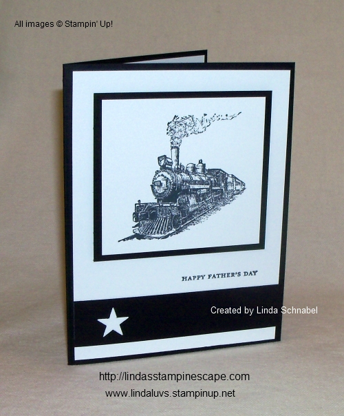
June is full of graduations, weddings and Father’s Day!  I think that it’s a perfect time for the new catalog to be released.  Today I want to share with you a “sneak peek” from the new catalog …. honoring fathers.

My Father’s Day card is simple, and done in Basic Black and Whisper White.  Sometimes simplicity say’s so much more …

000_1082

The train stamp comes from the new stamp set: Traveler.  This is a perfect set for masculine cards, people who love to travel (of course) and scrapbookers.  I can’t wait for you to see the whole set!

If you are signing up for one of my 2014-15 Technique or Stampin’ Clubs … you will get your catalog FREE!  If you are not going to be in one of my clubs, you can get your FREE catalog by placing an on-line order of $25 or more (and I’ll send you one) or join me at my KICK-OFF Party:

Date: Tuesday, June 3rd
Time: 6:00 pm – 9 pm
Place: VFW Hall – West Bend. WI
Cost: $15.00 for 10 cards / includes envelopes!
And catalogs … yes, plenty of catalogs!

RSVP by FRIDAY, MAY 30th
(262) 334-1009

Good News … to all of you who have placed on on-line order with me in the past month will also get your 2014-15 Catalog FREE … watch your mail box, it’s coming!!  But I’d also love to see you at the kick off party too 🙂

Back to the card …

000_1084

The “Happy Father’s Day” greeting comes from the Teeny Tiny Wishes stamp set.  I am so happy this stamp set did not retire.  I find that I need a small greeting and this set works perfectly.

I finished off the card with a simple block of black and punched out a star from the new “Itty Bitty Accents” Punch Pak.  This is also new and available at the catalog kick-off party.

I hope you enjoyed today’s card share and I thank you for stopping over.

Enjoy the day!

blog-closing-small


Happy Retirement … Masculine Card

Hello Stampin’ Friends,

Today I’m going to share a simple card you can easily recreate for your loved ones that are heading into retirement.  It seems to be that time of year!  We know all to well that this is the time of year Stampin’ Up! retires stamp sets and accessories to make room for the new!

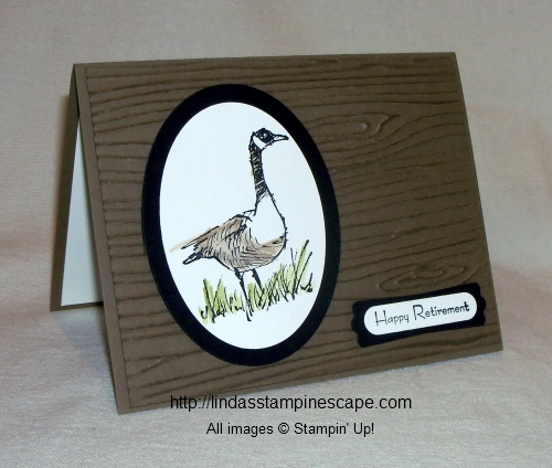
My card is geared more towards a man, but I know of few women who are avid outdoors “women” so it would be perfect for them too.

000_1049

I began with the “Wetlands” stamp set.  I use this stamp set a lot … the greetings alone are worth the price, and I love, love, love, that wheat!  And, well the birds … what can I say “they’re perfect”.  I wanted the goose to stand out so I framed it using the “Ovals Collection” framelits.

And … what works better for an outdoor card than the “Woodgrain” embossing folder!  To make this pop even more, I brayered Crumb Cake Ink over the Crumb Cake cardstock!  You actually brayer after the cardstock is embossed.  It’s a simple technique and really makes the embossing stand out, and give it a real two-tone appearance.

000_1051

The goose was stamped with the StazOn™ ink and colored with the use of the Blender pens and Crumb Cake and Old Olive ink pads!  Easy 🙂

For my greeting, I chose the “Happy Retirement” for “Tiny Tiny Wishes” … I’m so happy that did not retire!  It has so many occasions and it pairs perfectly with the “Word Window” and “Modern Label” punches.

If you are ready for retirement… I wish you a happy one!

Thank you for dropping by today and …

Have an awesome weekend!

blog-closing-small


Make a Wish Come True …

Hello Stampin’ Friends,

For those of you who stopped by to visit me yesterday and came back to see my updated version of my Easter Egg Hunt … you’ll have to wait one more day (my dyed eggs are drying)!

In the meantime, I have a nice masculine card for you.  I began with the “Retro Fresh” Designer Series Paper.  I love how colorful this paper is, and works well with a “guy card”.

000_0989

Banners are hot … you see them every where, but I wanted to add a bit of dimension so I punched my Early Espresso banner with the “Chevron Border Punch.  I layered that over a “Cajan Craze” banner.

You can find the Chevron punch and the designer paper in the “Celebrate the Everyday” catalog.

I was looking for a nice birthday wish that looks a bit masculine, and thought the rough edges on the “wish” fit well.  You will find this stamp in the “Make a Wish” stamp set.  I used Early Espresso Ink on the Very Vanilla … then rounded off the two opposite corners with the “Corner Edge” punch.  I matted it with Early Espresso and punched the corners to match.

000_0991

Just a note; I did pop up the Espresso banner and the greeting.

Thanks for stopping by today … I’m off to see if my eggs are dry! 🙂

Have a fabulous week.

blog-closing-small


Rev Up the Fun!

Hello Stampin’ Friends,

Hope you all had a wonderful weekend.  I caught a glimpse of the qualifying runs for the Daytona 500 – that means Spring is just around the corner … right?  It also inspired my card for today’s share.

With all the beautiful floral stamp sets in the Stampin’ Up! catalog, it seems “man cards” are few and far between.  If you are in need of an idea, I hope this inspires you.  It will also work great for a kids card.

000_0789

My color pallet today is simple … Midnight Muse and Whisper White.  I chose the “Rev Up the Fun” stamp set and the race car.  The greeting is included in the stamp set.  The tire tracks stamp is great for the inside of this card … and don’t forget to stamp the envelope too!

I embossed the bottom half of the card with the “Chevron” textured embossing folder.  When I was ready to stamp the car, I wanted it to look like it was racing across the card, so I began at the right side, held it down for a bit to ensure I had a nice dark color … then dragged it backwards.

Here’s a tip … Practice, practice, practice.  This way you make sure you got a good feel of how you want it too look, and to make sure your not dragging it crooked across the card.

000_0784

Next I used the “Word Bubble Framelit Dies” and cut out a word bubble that fit the greeting.  I set my greetings inside the word bubble dies to make sure they fit, before I cut.

Then I stamped my greeting on a separate piece of white cardstock and popped it up behind the opening.  I then added Stampin’ Dimensionals to the rest of the piece before mounting it onto the Midnight Muse mat.

My final step was to add the ribbon … I tied a knot in it before attaching (more manly than a bow).  Then I just used my Snail adhesive to adhere the card front to the base.

000_0789

Thank you so much for checking out my blog today.  Hope I inspired you to start your week off by “Rev’in up the Fun”.

Take good care ~

blog-closing-small

Here is a list of supplies used for today’s card …

 ITEM

 PRICE

 DESCRIPTION

130520

$18.95

 Rev Up the Fun Stamp Set – WOOD

130523

$14.95

 Rev Up the Fun Stamp Set – CLEAR

127749

$7.95

 Chevron Textured Embossing Folder

126847

$8.95

 Midnight Muse 3/8” Stitched Satin Ribbon

132968

$24.95

 Word Bubble Framelit Dies

104430

$3.95

 Stampin’ Dimensionals

I made sure that the items used today will qualify for a FREESale-a-Bration item!  Clicking on the item number will link you to my on-line store.  Thank YOU!