Sunflower Card — A Simple Techniques with Stunning Results

Hello Stampin’ Friends ~

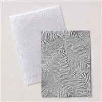
There’s something about sunflowers that warms the heart, even on the chilliest days… and today’s project captures exactly that feeling. I’m shining a little spotlight on the Sunflower 3-D Embossing Folder, and oh my goodness — this folder truly does all the work for you. With just one pass through your machine, you get this gorgeous, dimensional sunflower design that instantly elevates your card. Whether you’re creating a background for your cardmaking or adding texture to a scrapbook layout, it brings that soft touch of nature we love.

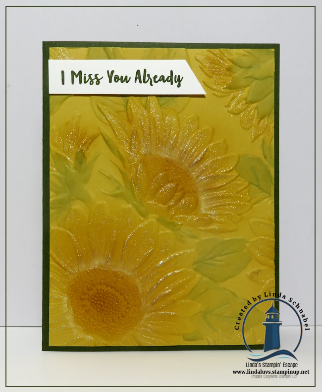
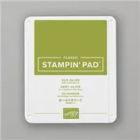
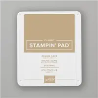
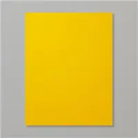
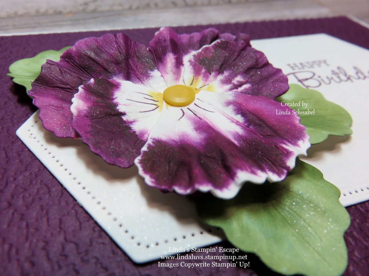
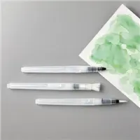
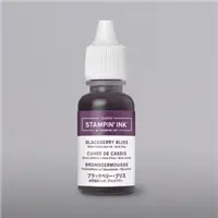
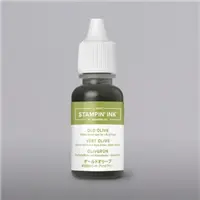
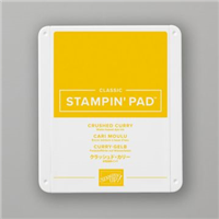
My card today uses the most simple layout — proof that you don’t need complicated steps to create something beautiful. The Garden Green card base (8-1/2″ x 5-1/2″, scored at 4-1/4″) frames the Crushed Curry embossed layer perfectly. And from there… it’s all about the little touches. I added a wash of Garden Green to the leaves using our Water Painters, just enough to give a soft, watercolor feel without overpowering the sunflowers. Then, with a light hand and a sponge dauber, I brushed Crumb Cake ink into the centers and lightly onto the petals, adding warmth and depth. A little Wink of Stella brings that gentle sparkle — like sunlight catching the edges of each petal.

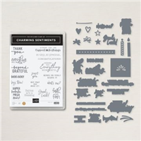
To finish the card, I stamped I Miss You Already from the Right Words Stamp Set. It felt fitting today… the air has turned crisp, the last leaves have drifted from the trees, and autumn seems to have slipped quietly away. I miss it already — and this sunflower brings a little of that golden glow back.

I hope this card inspires you to pull out your embossing folders and play with color, texture, and sparkle. The Sunflower 3-D Embossing Folder is truly a must-have for quick, stunning cards — and you’ll find all the product links below if it’s calling your name.

Thanks for stopping by today, my friends. Stay warm, stay creative, and let your craft space brighten your day. 🌻✨

Bring the Beauty of Nature to Life with Watercoloring!

Hello Stampin’ Friends ~

Today we’re heading outdoors—at least in spirit—as we explore easy watercoloring techniques using the Prairie Grass stamp set. 🌾

In this video tutorial, I’ll walk you through creating soft, blended backgrounds that capture the essence of nature, along with tips for adding depth and texture to your stamped images. Whether you’re crafting cards, scrapbooking memories, or working on another paper project, these techniques are simple, versatile, and so much fun!

📽️ Watch the full video below to see these techniques in action! CLICK HERE to watch the video.

💚 Thanks so much for stopping by today! I hope this tutorial inspires you to try these watercolor techniques with your own projects. I’d love to hear what you think—leave me a comment below and let me know if you give it a try.

Until next time, happy stamping and happy creating! 🌿

Saying Goodbye to Pansy Patch Card Parade

Hello Stampin’ Friends ~

As new trends emerge in the world of crafting, it’s inevitable that we must bid farewell to some beloved classics. Today, I’m going to reminisce about one such gem: the Pansy Patch Stamp Set, and share several cards with you. With its elegant floral appeal and versatile design, this stamp set has been a staple in the repertoire of cardmakers and crafters alike.

For many, the Pansy Patch Stamp Set has been more than just a collection of stamps; it’s been a source of inspiration and creativity. Whether adorning handmade cards, embellishing gift tags, or adding a touch of charm to scrapbook pages, the possibilities with this set have been endless.

One of the standout features of the Pansy Patch Stamp Set is its versatility. You can choose to layer the stamps to create stunning floral arrangements, each petal coming to life with every inked impression. Alternatively, you could opt to use the coordinating dies to cut out intricate pansy shapes, adding dimension and depth to your creations. The beauty of this set was that it allows for endless experimentation and exploration, inviting you to let your creativity run wild.

One of the things that make the Pansy Patch Stamp Set truly special is its ability to effortlessly elevate any project. With a range of beautiful sentiments included, it becomes effortless to convey heartfelt messages and well wishes. From birthdays to weddings, sympathy cards to thank-you notes, the Pansy Patch Stamp Set has been there to help us express ourselves in style.

But as all good things must come to an end, so too must the reign of the Pansy Patch Stamp Set. With its retirement on the horizon, now is the time to pay tribute to this timeless classic and celebrate the joy it has brought to so many. The Pansy Patch Stamp Set has been a true workhorse in my stamping stash.

Ok … I have one more for you, and my favorite!!

I have created a video for you from a past Facebook LIVE (CLICK HERE TO WATCH) so you can see step by step how I created these beautiful flowers and so you can recreate this too…. They almost look real don’t they?

Isn’t that cool … I am in love with this technique! I loved it when I made pansies from the butterfly punch but these are so much more realistic!! It creates so much texture and depth when you “scrunch” your petals.

Those little white specs you see are actually the “shimmer” paper making a statement! It really is so pretty and you can do these in any color you’d like! Here is my inspiration to create these amazing pansies ….

Now because shimmer paper has since retired, I use the regular Basic White or you may also use the Thick White cardstock.

Did you enjoy the parade of cards today? I hope it truly showcases this stamp set and coordinating dies versatility. So, if you haven’t already, now is the perfect time to snag your own Pansy Patch Stamp Set before it’s gone for good. I’m sure these will become cherished staples in your creative arsenal. Don’t miss your chance to add a touch of elegance and charm to your handmade cards and gifts with the Pansy Patch Stamp Set. Get yours today and let your creativity blossom!

Thanks for stopping by today!

TODAY’S STAMPIN’ SUPPLY LIST … If you liked the products used in today’s projects, I have links for you below. Just click on the item you would like more information on, or to begin your shopping. It will take you directly to my website. Thank you

Saying Farewell to a Classic: In the Moment Stamp Set

Hello Stampin’ Friends ~

As April approaches, so does the end of an era for many stamping enthusiasts. Stampin’ Up’s retirement list is out, and among the beloved sets bidding us adieu is the timeless “In the Moment” stamp set. This set has been a staple for many of us, offering versatility and creativity for a multitude of projects. As we bid farewell to this classic, let’s take a moment to appreciate its beauty and versatility.

I had to add this stamp set to my collection because it captures the essence of life in a way that resonates deeply with those we make our cards for. The “In the Moment” stamp offers a glimpse into the beauty of everyday moments with its heartfelt imagery and sentiments.

What I love about this set is the line-art images can be colored using your favorite coloring techniques. The intricate line art of the images lends itself beautifully to the soft, ethereal look of watercolors. By simply stamping the images onto watercolor paper and adding a touch of color, you can create stunning works of art that are sure to impress.

Another way to make the most of “In the Moment” is by pairing it with any one of our beautiful designer series paper. The next card highlights the Countryside Inn Designer Series Paper,

At the heart of the “In the Moment” stamp set lies a charming depiction of a woman and her faithful companion, a dog by her side as she reads a book. This captures the simple joy of companionship and relaxation. Whether you’re a dog lover yourself or know someone who is, this stamp is sure to tug at the heartstrings and evoke feelings of warmth and that moment one needs for themselves …. Because you deserve it!

If you love a touch of celestial beauty in your projects, look no further than the Stargazing Designer Series Paper. Paired with the “In the Moment” stamp set, this paper brings a sense of serenity and wonder to your cards. The Stargazing paper adds a magical touch to your crafting.

You have to love the image of a woman leisurely enjoying a glass of wine, her gaze fixated on the stars, or make it what you’d like …. watching the sunset, admiring nature’s beauty, or simply lost in her own thoughts, this scene exudes an air of relaxation. It’s a beautiful way to tell someone that they are in your thoughts.

As we bid farewell to the “In the Moment” stamp set, now is the perfect time to stock up on this versatile set and coordinating designer series papers before they retire at the end of April 2024. The “In the Moment” stamp set has something to offer for everyone. Don’t miss your chance to add this classic set to your collection and create heartfelt works of art that will be cherished for years to come.

Thanks for stopping buy. Enjoy your day ~

Most Adored Gold with Night of Navy Accents

Hello Stampin’ Friends,

In the world of crafting and creative expression, certain elements stand out as timeless and beloved. Gold is undoubtedly one such element, radiating opulence and sophistication. Today, our product spotlight revolves around the Most Adored, and we’re going to explore how Night of Navy, a rich and deep hue, beautifully complements the regality of gold. 

The Most Adored Designer paper has captured the hearts of stampers worldwide with its premium quality and versatile appeal. Along with the Gold Foil designs and cute Valentine designs on the “flip side”, what makes it so popular is that you can get it for FREE during our Sale-a-bration promotion, with a qualifying purchase.

For today’s creative adventure, we turn our attention to Night of Navy. This deep, dark blue is synonymous with elegance and pairs seamlessly with the richness of gold. I used the swirl pattern and infused it with Night of Navy ink and my Water Painter. It appears to be dancing harmoniously with the golden accents, creating a mesmerizing effect.

I used the Watercolor Wash Technique over the Most Adored Designer paper, as it dries it lightens, so I went back over some areas with more ink to get the true Night of Navy color too. The die cut circles with a border of circles comes from the Everyday Detail Dies. And to take it over the top … I embossed the Paper Butterfly in Gold and embellished it with gold pearls from the Festive Pearls collection. 

On the flip side, we delve into the romantic realm with Card #2. Here, I used both sides of this sheet of designer paper with punched Hearts, and die cut the little hearts from our Sending Love Dies. As we approach the season of love, this creation becomes the perfect canvas for a heartfelt Valentine’s Day card. The Basic White background adds a sense of stability, making the hearts pop with warmth and affection.

My greeting comes from the Throughout the Year stamp set. You all know I love my sentiment sets, especially when they provide so much versatility as this one does. This was highlighted by die cutting the greeting from the Something Fancy Dies.

I’ll conclude the Most Adored collection, with its resplendent gold and Valentine themed flip side takes center stage in the world of crafting. The Night of Navy emerges as the perfect companion, adding depth and elegance to our project. So, whether you’re crafting a mesmerizing swirl pattern or crafting a heartfelt Valentine’s Day card with punched gold hearts, embrace the magic of Most Adored Designer Series paper.

Thank you for joining me today, I’ll meet you back here tomorrow featuring yet another color combination, and flip side card!

Create Stunning Watercolor Pansies

Hello Stampin’ Friends ~

Have you ever wondered “how they did that”? Today’s video shows you how to Create Stunning Watercolor Pansies!! Sometimes it’s a good teacher to look back at some of the things we’ve done in the past. I am so excited these did not retire and are still in the catalog for us to create with. I have combined an old technique with our new Pansy Petals and the results are stunning!

I have created a video for you from my Facebook LIVE last night so you can watch step by step how easy it is to create these beautiful flowers …. They almost look real don’t they?

Isn’t that cool … I am in love with this technique! In the past I made pansies from the butterfly punch but this is more realistic!! It creates so much texture and depth when you “scrunch” your petals.

Those little white specs you see are actually the “shimmer” paper making a statement… now we have our Wink of Stella if you like that bling! It really is so pretty and you can do these in any color you’d like! Here is what I whipped up quickly last night after my LIVE demo ….

Not bad for a 2 minute card!! You can use any designer paper for your background and just added the flowers and my greeting … simple!

Thanks for joining me today! Hope your day is an awesome one ~

TODAY’S STAMPIN’ SUPPLY LIST … If you liked the products used in today’s projects, I have links for you below. Some maybe substitutes for original product used. Just click on the item you would like more information on, or to begin your shopping. It will take you directly to my website. Thank you

Beautiful Butterflies …

Hello Stampin’ Friends ~

Today I’m excited to share two fun technique cards that are highlighting the “retiring” Brilliant wings dies. These dies come in handy so many times for a quick card … and if you join me tonight on my Facebook LIVE, I’ll show you another 2 ways (or more) to use these!!

The first card show a fun way to use watercolor backgrounds … On the small butterfly, I just cut it out of the watercolor background created in the video. The larger butterfly was die cut, and the background was trimmed to accent the butterfly and give it a 3-D look. I popped up the butterfly by cutting a small piece out of the Stampin’ Dimensonals.

My greeting comes from the Peaceful Moments stamp set and is stamped with the Rock -n- Roll technique. I inked up the stamp with Parakeet Party first, and then rolled the stamp in the Bermuda Bay. I choose that color because the Parakeet Party and Bermuda Bay used in the watercolor background change color a little when blended together.

The greeting has a Basic Black mat as do the butterflies and were mounted onto my Coastal Cabana front that I embossed with the 3-D Fern embossing folder. I added Wink of Stella to my butterflies before mounting onto the black mat. To complete my card I added the Mat Black Dots to create additional depth and texture and to draw your eye around the entire card.

CLICK HERE if you would like to watch the Watercolor Background video again.

My second card I used the “Masking Paper” to create the card front. I cut out butterflies from Brilliant Wings out of the Masking paper and then adhered it directly onto the Linen paper (retiring).

Then with alcohol in my Spritzer and about 5 drops of Bermuda Bay ink … I spritzed the color onto the Linen paper. The alcohol helps to dry the ink faster, and what it leaves behind when you remove the “butterfly masks” is a soft beautiful “dyed” Linen paper.

I invited you to join me tonight on my Linda’s Stampin’ Escape Facebook page and watch me LIVE at 6:30 pm to see how I use these amazing butterfly dies, and I’ll also be highlighting some amazing designer paper!!

Thank You for hanging out with me today! Enjoy your day ~

Here is a list of ingredients that I used to create today’s card. NOTE: All orders of $50 will receive a FREE qualifying Sale-a-bration item of your choice.

Amazing Silhouettes Card in Watercolor

Hello Stampin’ Friends ~

Today I’m sharing the last of the 3 images in the Amazing Silhouettes stamp set. I’m using a touch of watercoloring with this one. I began by stamping the leaf image on to one of the watercolor patterns in the Dainty Flowers Designer papers in Old Olive. Yes, I stamped my image onto designer paper.

I added water to the middle size Water Painter and I used it to activate the ink and give it a more watercolor look. Then I added a little more ink to the image using the Water Painter giving it more depth of color…..

Once dry, I added a Mossy Meadow mat to it and wrapped the corner with the 3/4″ White Frayed Ribbon and then some of the natural Bakers Twine. These add so much texture to the card and create a framed edge for our foliage.

Using another pattern from the Dainty Flowers I cut into two pieces and used one side to highlight the green and the other to highlight the freesia that is found on the original piece that I stamped on. I layered these three pieces together and mounted them onto my cardfront.

I used Mossy Meadow for my card front and then embossed it with the Stitched Greenery Die. It gives the project some texture and a touch of greenery! You’ll love how the intricate detail dresses up the card perfectly.

No bling on this card because I wanted to keep it more natural. I added the card front to my base in Mossy Meadow … I love layering color on color, it’s such soft and subtle look.

Hope you enjoyed the three different looks / techniques that showcased the Amazing Silhouettes. I have to “Thank” my friend Karen who booked a workshop and asked to see this stamp set. It totally changed my mind … I love it! It’s unique and lends itself to many different techniques.

Thanks for popping in today, I hope you have a wonderful Tuesday!

Here is a list of ingredients used in today’s card. You can click on any one for more information about the product, or to begin shopping at my OnLine store. Thank you for your support

Beautifully Happy & Watercolor Pencils

Hello Stampin’ Friends ~

Today I’m going to introduce you to the magic of Beautifully Happy & Water color pencils, these two make the perfect coloring combination and it’s great for beginner stampers, or anyone of us who just loves to color. The Beautifully Happy Stamp Set can be found in our Sale-a-bration Catalog.

We begin with a plain white (Basic White) piece of paper and stamp your image with the Momento or the StazOn ink. Then I lightly color in my petals with the “Balmy Blue” watercolor pencil … I’m using Assortment 2 (found on page 126) in the Annual Catalog.

Next, I darken the area closest to the center where the flower dips down and again by following the lines in the stamped image. Now you can blend your pencil color with the Blender Pens. These are filled with specialized solution for easier blending. I did the same technique with my leaves in Garden Green, and a little dab of Crushed Curry for the center of my flower.

Once I completed my coloring, which I find so relaxing, in fact … I like to stamp several images and color them all at once, then set them aside for when I need a quick card. The base and front piece for my card are both Basic White. The front piece was embossed with the Timeworn Type 3D Embossing Folder. The flower image was then attached to the front of my card using the Stampin’ Dimensionals.

The greeting comes from the Beautifully Happy stamp set. If those pretty Hollyhocks don’t get you, the beautiful sentiments in this set will. They are a perfect combination to make “beautiful” cards with the perfect sentiment. I used the Double Oval punch to highlight my greeting and pop it up.

To complete the look, I added the Mango embellishments from the Adhesive Backed Milky Dots … my new favorites! You will find them on page 31 of the Jan-April Mini Catalog. The come in four colors; Mango Melody, Night of Navy, Petal Pink and Clear. They just seem to go with anything!

I hope you were inspired to pick up your Watercolor Pencils again, learned a new stampin’ tip, or hack for quick cards. Let me know in the comments below.

Thank you for stopping by today! Have a fabulous Monday.

Here is a list of supplies used for todays card ….

Free Tutorial Friday: Birthday Brew

Hello Stampin’ Friends ~

It’s another FREE Tutorial Friday and if your from Wisconsin that also means it’s time for a Friday Night Fish Fry … and what goes better with your Fish Fry than a nice cold brew!! Today’s card tutorial features the Brewed for You stamp set.

Measurements: 

  • Card Base: Crushed Curry 5 ½” x 8 ½”
  • Cardstock #2: Basic White 4” x 5 ¼”

Instructions:

  • Cut a 5 ½’ x 8 ½” Crushed Curry card base. Fold in half.
  • Cut a 4” x 5 ¼” Basic White panel.
  • Stamp (3) large and (4) small Watercolor Circles onto the Basic White panel using Crushed Curry ink.
  • Lightly spritz a little water to soften the edges. Let dry completely.
  • Using a Water Painter, add Crushed Curry ink to the brush and tap to speckle ink all over the panel as desired. Let dry completely.
  • Adhere the panel to the card front.
  • On a scrap piece of Basic White, stamp the glasses and foam using Jet Black Stazon ink.
  • Color the glasses using Crushed Curry ink and a Water painter. Cut.
  •  Cut a ¾” x 2 ½” strip of Basic White cardstock.
  • Stamp the sentiment using Jet Black Stazon ink. Cut the right edge to form a banner.
  • Adhere the sentiment to the top of the card using Stampin’ Dimensionals.
  • Cut a 2 ¾” Crushed Curry circle.
  • Cut a 2 1/8” Basic White circle.
  • Stamp the sentiment onto the circle using Jet Black Stazon ink.
  • Adhere the sentiment to the Crushed Curry Circle.
  • Adhere the circle to the card front.
  • Adhere the glasses to the card front using Stampin’ Dimensionals.

I think this is a perfect card for a Friday FREE Tutorial, Oh, Ale Yes!! Enjoy your Friday and enjoy your weekend.

Thank you for hanging out with me for a cold one today!

Here is a list of supplies used to create this card ….

Are You Ready??

Hello Stampin’ Friends!

And welcome to my blog. Are you ready? Ready to see the last of my watercoloring techniques? For the past 3 weeks I have been celebrating World Watercoloring Month. I began with a simple “Waterwash” background.

If you would like more information about this card CLICK HERE to view the original post.

The second card highlights the dual color watercolor wash where you start one color from the top and the second from the bottom and let them meet in the middle … gives you a brand new color there!

The next week we added the Emboss Resist technique to our watercolored background … this really looks so nice together with that fun surprise of the embossed image / greeting!

If you want to read more about this card CLICK HERE for more information.

The fourth card takes the heat embossing in a bit of a different direction. Instead of resisting the watercolor like our card above … you use the embossed image more as a guide to help highlight your watercoloring.

I want to invite you to join me tonight for my Facebook LIVE where I will be showing you a beautiful watercoloring technique that is going to blow your mind … it creates a stunning image! You won’t want to miss this one, so ARE YOU READY??

Join me for the No Line Watercoloring Technique! I’ll be using one of your favorite stamp sets.

Thank you for hanging out with me … see you tonight!

Take good care ~

Here is a list of the ingredients that I used for one or both of the cards. Remember, every $50 purchased, is rewarded with a exclusive Sale-a-bration item.

Watercolor & Embossing = WOW Cards!

Hello Stamping Friends ~

So happy you joined me today for my Watercolor + Embossing card techniques. I have two cards for you today along with the replay video of last nights Facebook LIVE presentation. You’ll see how easy it is, and more importantly … FUN!

Let’s take a look at the video and then I will present the cards along with the ingredients and any dimensions you may need.

I hope you are falling in love with this beautiful technique, and as I stated in the video … using ink from your stamp pads on your blocks is a simple way to start. AND less messy!! For the Watercolor Wash Resist technique, I am using the “Shimmery White” Cardstock which is cut to a quarter sheet … 5-1/2″ x 4-1/4″ to start. I like to keep it simple.

The stamped image comes from the Good Feelings stamp set which is full of happy! You can check out all the sayings included in the set at the bottoms of my post.

Once dried, I used the 2nd scallop frame from the Scallop Contour dies to die cut our design out. I used the small die from the same set to create the pop of color around our large die cut image. These were then layered onto a 5-1/4″ x 4″ piece of Basic Black and then layered onto the Basic White card base. While I had the White cardstock out, I punched two daisies and layered them onto my card … to finish it off, I used the Glossy Dots to tie it all together.

Now let’s take a look at the card that I designed from my second demonstration using the Splendid Thoughts bundle …

Embossing with the white emboss powder highlights your watercoloring and creates a soft beautiful look … watercoloring within an embossed image is easy and makes YOU look like the artist!! The soft look just pops against this stunning Fresh Freesia foil specialty paper from the Splendid Day Designer Paper. This was attached to the Basic White base is 8-1/2″ x 5-1/2″ scored and folded at 4-1/4″.

I used a medium scallop die to cut the Vellum cardstock on which I layered our watercolor images and die cuts from the beautiful foil paper. Layering the vellum onto the foil creates almost an iridescent look which just highlights the greenery even more.

Let me introduce you to the Charming Sentiments bundle … oh, I love this one!! So many greetings for so many occasions and they have coordinating and accent dies!! I love the way the greeting pulls my entire card together.

Thank you for hanging out with me today.

Here is the list of products I used on both of my cards. The bundles were selected just for you because they are so versatile and can be used year round … plus, either one will qualify you for a FREE Sale-a-bration item!! Let me know if you need any help with your order.

The Beauty of Watercoloring

Hello Stampin’ Friends!

And welcome to my blog as we take a look at the Beauty of Watercoloring today. I would like to share the replay of my Facebook LIVE that shows you step by step how to create 4 different Watercolor Wash backgrounds. With that I will share the cards I created with those backgrounds. Here is the video ….

Here is the card I shared in the video from the first background I created. This technique reflects the Ombre look as the color fades from dark to light. I used the Splendid Stems dies to frame my greeting… and you all know how I love my greetings!!

If you would like more information about this card CLICK HERE to view the original post.

The second card highlights the dual color watercolor wash where you start one color from the top and the second from the bottom and let them meet in the middle … gives you a brand new color there!

The third card is a blending of multiple colors! If you’re not sure what colors go together … let nature be your guide! Here I used the colors of an early sunset, when the skies are pink and blue with a few shades of purple. I framed part of the background and used it for my moon!

If you want to read more about this card CLICK HERE for more information.

The fourth card I made had multiple colors and I added Sea Salt which pulled up some of the color which created some “spots”. This time I die cut my background … this technique is not just for backgrounds but can be used in many ways!

Full details for my butterfly card can be found HERE.

I want to thank you for joining me today on my blog … and invite you to join me tonight for my Facebook LIVE where I will be showing you an easy & beautiful technique watercoloring heat embossing images.

Take good care ~

Here is a list of the ingredients that I used for one or both of the cards. Remember, every $50 purchased, is rewarded with a exclusive Sale-a-bration item.

Watercolor Wonder Butterflies …

Hello Stampin’ Friends ~

Today I’m excited to share one more way to use the watercolor backgrounds … I’ll show you how to make Watercolor Wonder Butterflies. Who said these beautiful backgrounds can only be used as backgrounds? Today I’m going to pull them up center stage on our card ….

I’m using the Brilliant Wings Dies to create these fun looks … On the small butterfly, I just cut it out of the watercolor background created in the video. The larger butterfly was die cut, and the background was trimmed to accent the butterfly and give it a 3-D look. I popped up the butterfly by cutting a small piece out of the Stampin’ Dimensonals.

My greeting comes from the Peaceful Moments stamp set and is stamped with the Rock -n- Roll technique. I inked up the stamp with Parakeet Party first, and then rolled the stamp in the Bermuda Bay. I choose that color because the Parakeet Party and Bermuda Bay used in the watercolor background change color a little when blended together.

The greeting has a Basic Black mat as do the butterflies and were mounted onto my Coastal Cabana front that I embossed with the 3-D Fern embossing folder. I added Wink of Stella to my butterflies before mounting onto the black mat. To complete my card I added the Mat Black Dots to create additional depth and texture and to draw your eye around the entire card.

Funny, but I always think of my Mom when I use or stamp with butterflies … she loved them and had them all over her house ❤

Thank You for hanging out with me today … CLICK HERE if you would like to watch the Watercolor Background video again.

Have a great day ~

Here is a list of ingredients that I used to create today’s card. NOTE: All orders of $50 will receive a FREE qualifying Sale-a-bration item of your choice.

Watercolor Wash Backgrounds

Hello Stampin’ Friends!

Welcome to my blog and to today’s Watercolor Wash Backgrounds post where I will share some great tips for easy watercolored backgrounds. I’m using the Wet on Wet technique with our everyday ink pads!! You are going to marvel at how easy this is, and what amazing results you get!

I will have last nights replay of my Facebook LIVE to share with you, along with two cards created with our watercolor backgrounds.

Don’t you just love how easy that was … just a few simple tips:

  • Keep your watercolor paper wet (nice sheen) but NO puddles.
  • Have your colors ready and some water to clean your brush.
  • Don’t be afraid to experiment!

Here is the card I shared in the video. I used the Splendid Stems dies to frame my greeting… and you all know how I love my greetings!!

The measurements for both cards are the same except the double color card has and extra mat. The base is 8-1/2″ x 5-1/2″ with a Starry Sky front (4″ x 5-1/4″) that was embossed with the Painted Texture Embossing Folder. The watercolor paper is 4″ x 3″ so the mat is 4-1/4″ x 3-1/4″.

The greeting comes from the Flowering Tulip stamp set and is stamped in Starry Sky and die cut with the layering circles die. The greeting is adorn with the die cut leaves from the Splendid Thoughts Bundle and the card was completed by embellishing it with the Iridescent Rhinestones.

My next card highlights the dual color watercolor wash …

I used the Melon Mango and Calypso Coral inks. Measurements for the card are the same as above except for the second mat of Flirty Flamingo which measures 4-1/2″ x 3-1/2″. The palm tree and the fun border are both die cut using dies from the Palms dies.

The greeting is stamped directly onto the watercolor paper. This card is more stunning in person, the colors are much more brilliant. This card was so simple and easy to create!

I want to thank you for joining me today on my blog … I hope you enjoyed the video and the samples. I will be back tomorrow with another of of the backgrounds we created.

Take good care ~

Here is a list of the ingredients that I used for one or both of the cards. Remember, every $50 purchased, is rewarded with a exclusive Sale-a-bration item.